Playful and pragmatic: A conversation with Jackson Clements Burrows’ Chris Manderson

Jackson Clements Burrows are no strangers to Pace. As fellow Melburnians and long-term collaborators, this architecture firm pairs joyful exploration with contextual transformation in their Passivhaus designs. We spoke with Associate Director Chris Manderson about recent projects in the city we call home.

PDG

JCB is a design-led architectural practice. How does place influence process during your projects?

CM

Our work is often a direct response to the context we’re working within. We like to explore the narrative of the surrounding neighbourhood – trying to find that little bit of joy in the architecture, whether that comes from a place, the site or locality.

PDG

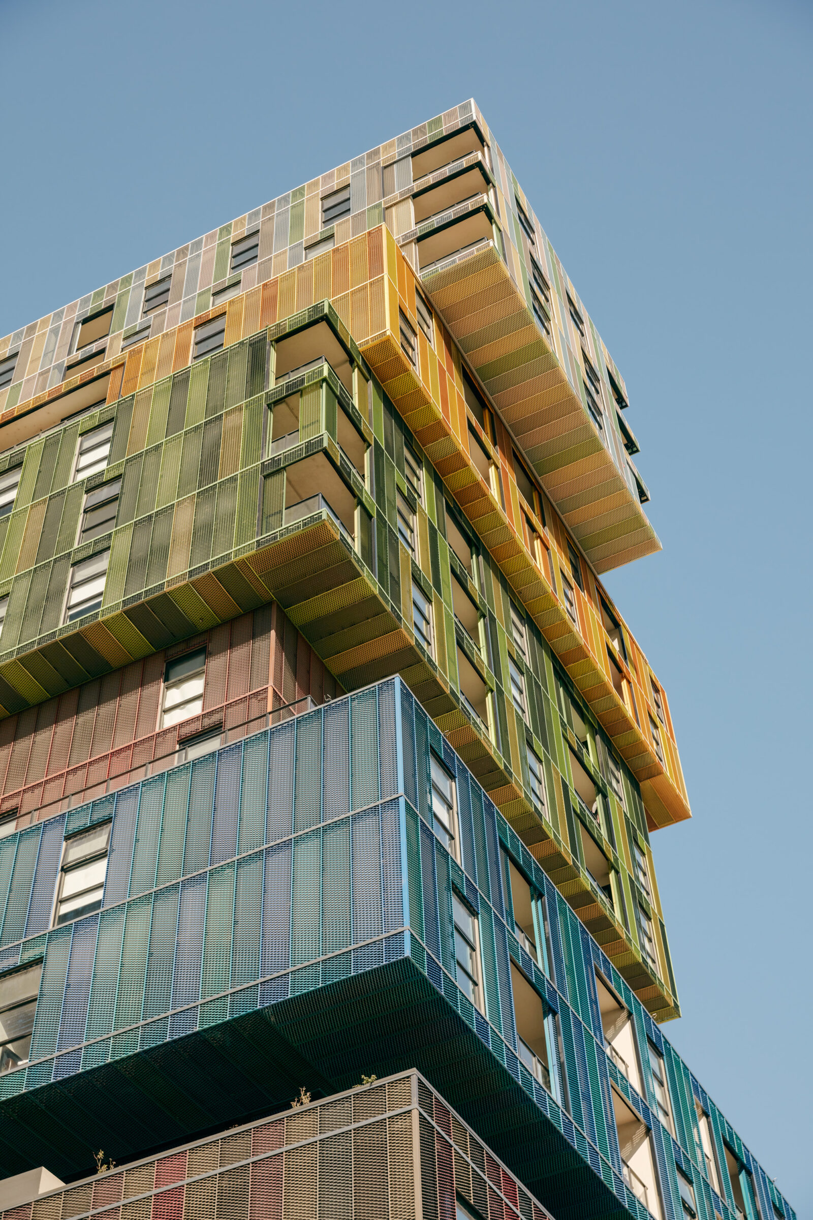
When it comes to our portfolio, nothing is quite as monumental as The Icon in St Kilda. What was the context for this project?

CM

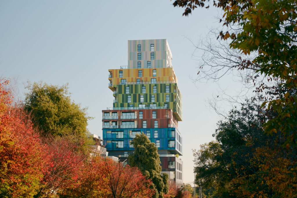
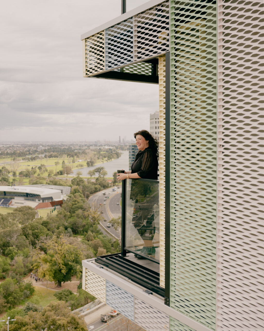
When you look at its locality, that junction was a drab spaghetti of concrete and roads. It really needed an architectural statement. For JCB, The Icon was all about the vibrancy of the lifestyle of St Kilda. We loved the idea that each coloured box created an identifiable moment and each box represented a neighbourhood for the occupant. Creating a sense of destination and of place. The colours also make a bold contribution to transforming the St Kilda Rd junction environment. It’s now become a great statement within Melbourne and within JCB’s identity too.

PDG

What can you share about JCB’s latest Pace projects across Cremorne and Hawthorn?

CM

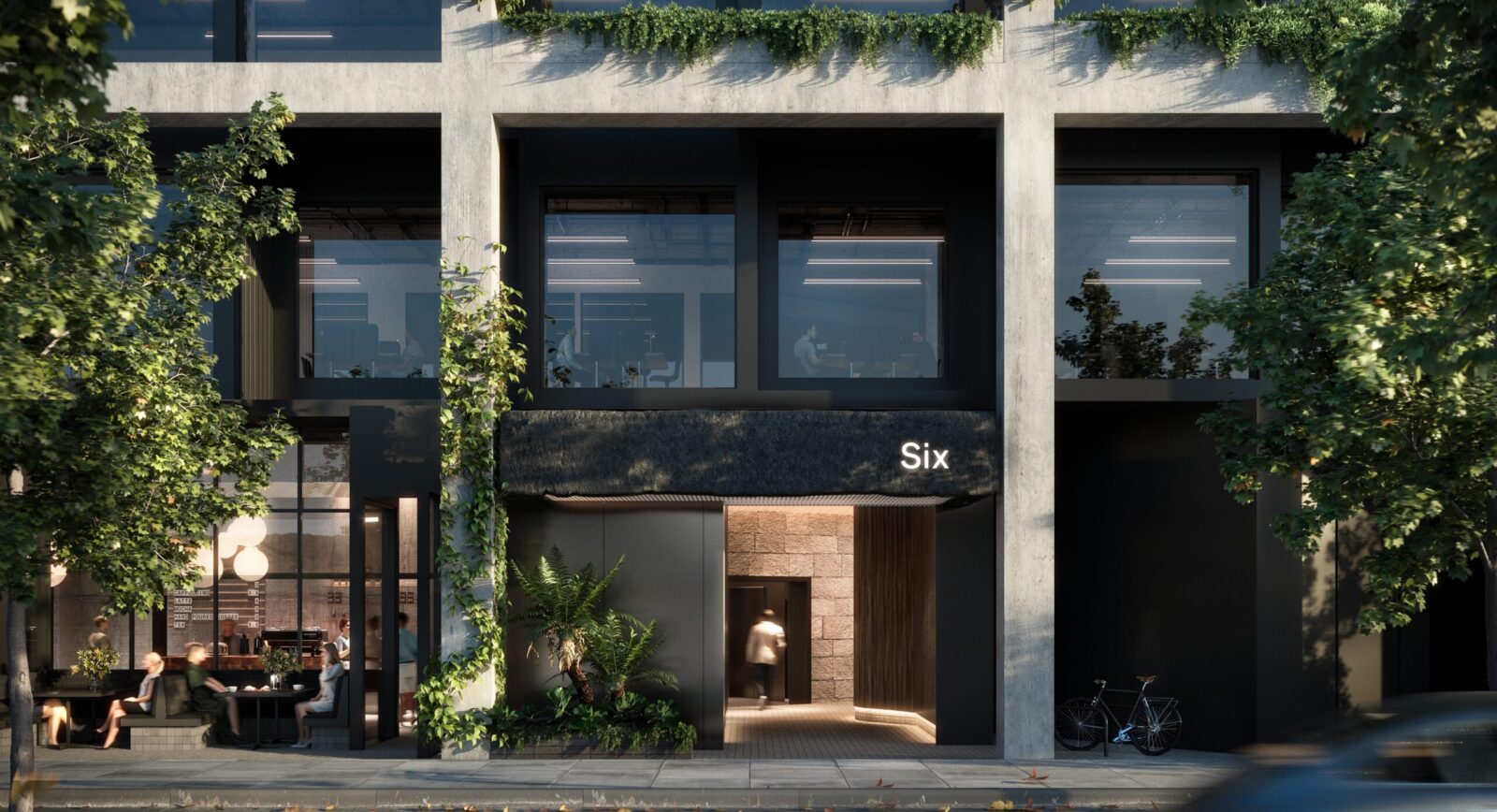
Six Cubitt Street: [Cremorne] – located in a concrete, hard-edged, gritty environment. It’s black, it’s dark, it’s moody, and it celebrates the idea of concrete and rectilinear forms. We’ve transformed this context, playfully pixelating or cubing the form with cantilevered boxes. It’s got this strong podium at the lower levels, almost visually disintegrating into these interesting void shapes.

Hawthorn East is another commercial project, the red brick base is derived from the “hawthorn red” warehouse and the upper facade is a dynamic black metal woven form which provides a juxtaposition to the surrounding concrete apartment buildings. This consists of a series of forms that twist in their fore-plate. The facades fold in two directions, wrapping around in a series of sun-screening vertical blades. It offers planter boxes for passive ESD protection to the facade, a cafe on the ground, and a series of office floors leading to an impressive rooftop terrace. Our work is often a direct response to the surroundings. Sometimes that creates quite interesting ideas, like The Icon, and other times it’s a lot more restrained, but I think joy is found in the meaning and variety of design response.

Journals
view all