A conversation with Chris Stanley, Director of Splinter Society

Splin­ter Soci­ety is a Mel­bourne-based archi­tec­ture and inte­ri­or design stu­dio com­mit­ted to crafting envi­ron­ments centred around the people who call them home. We spoke with Chris Stanley about his collaboration with Pace on Six Cubitt, his approach to design and what makes for a modern workspace.

PDG

Tell us a bit about Splinter Society?

CS

Myself and Asha – who’s my business partner and actual partner – set up our practice straight out of university. We loved making stuff and wanted to get our hands dirty as soon as possible. We absorb as much as we can from other people, cultures, crafts and other art forms. And try not to make our inspiration trend- or market-based but make it relevant to a time and place – we want to produce something that’ll connect with the people who’ll be using it and inhabiting it.

PDG

What’s it like working with Pace?

CS

Some developers come to us and it’s all about yield and maximisation. We have to convince them they need genuine points of difference and experiences that are more than just marketing. Pace is ahead of the curve on that, so it means our objectives are very much aligned. We want our designs to be loved and appreciated by people, and Pace wants a building occupied by people who really want to be there and stay for a long time.

PDG

What was the brief for Six Cubitt?

CS

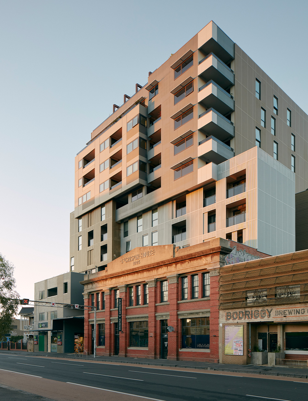
We’ve worked a lot in Cremorne – and there’s a lot of fine grain and history and richness in the area – so the brief was a conversation about who these people might be, what their needs might be and how we can create something for them. We needed to add interior elements to a spectacular building designed by the team at JCB. So the question was: How do we create something that fits with a bold building with strong elements and unique forms?

PDG

The site itself is unique. Did that create any challenges?

CS

We often talk about the glitches and quirks in a design that adds layers of the unexpected. The Six Cubitt site itself is this bizarre triangle with a finger sticking off it. But it’s one of the beauties of it – it’s not just this big box. It gives the building some really interesting interfaces and solutions. If you can get weird spaces and do something interesting with them – like JCB and Pace have done – then you’ll create a really special personality for the building that you’ll feel when you’re in it.

"We want our designs to be loved and appreciated by people, and Pace wants a building occupied by people who really want to be there and stay for a long time."

PDG

Has the approach to workspaces changed with the pandemic?

CS

With everyone having experienced the pleasure and pain of working from home, there’s a real desire for social interaction and communal spaces. So we’ve thought broadly about how people might like to use the spaces and how we can accommodate various uses for them. For example, the rooftop is really interesting. It’s designed to facilitate people in a whole range of activities: informal meeting spaces, hosting events, lunches and barbecues or even a premium product launch. Or just watch the sunset over the city.

PDG

Finally, what advice do you have for designers or people working with designers?

CS

At the end of the day, it’s quite easy to produce something ‘nice’ or generically pretty. It’s harder to produce something relevant and specific that will tap into a person and who they are. You need to think deeply about how you live and work and what you enjoy – what makes you you. Make sure the outcome is reflective of that rather than the newest thing that everyone else is getting at a particular point in time. Because not everyone’s the same, and it’s a shame when design doesn’t take that into consideration.

Journals
view all